
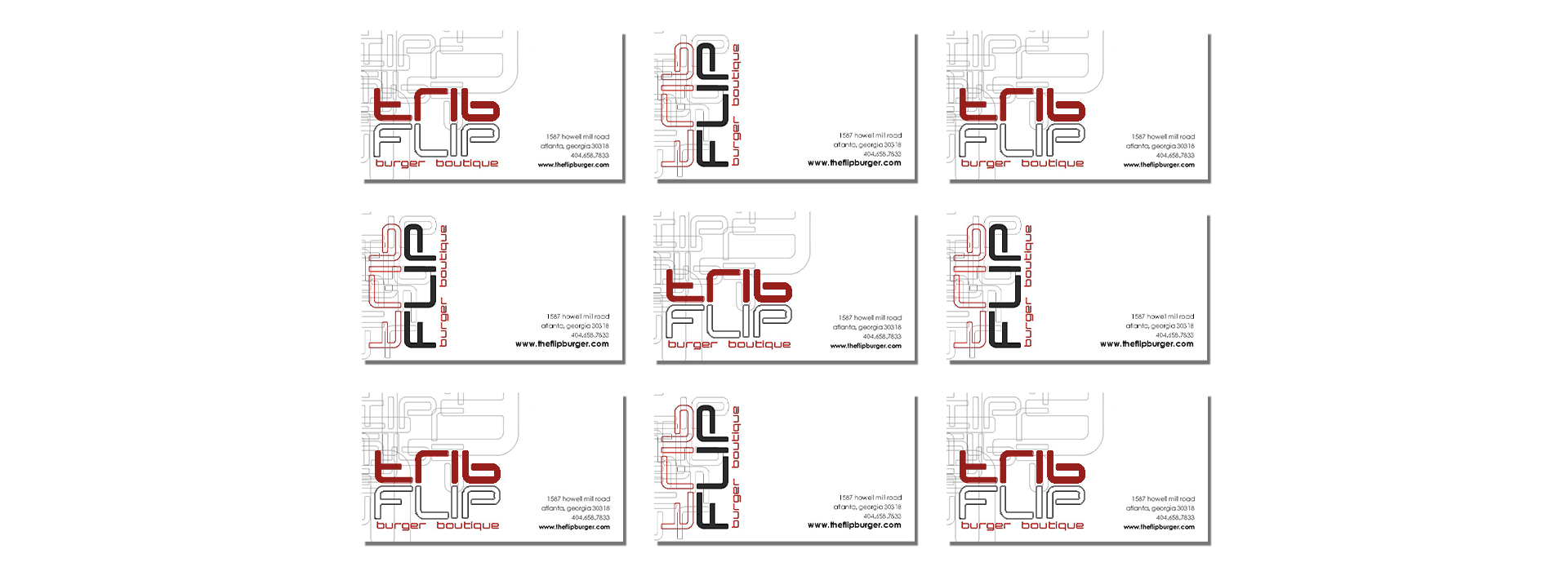
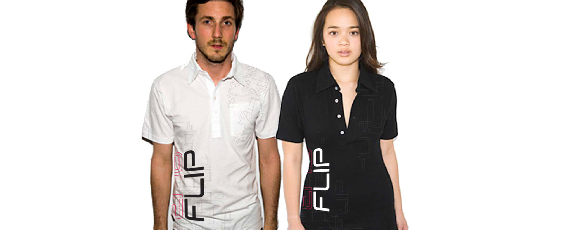
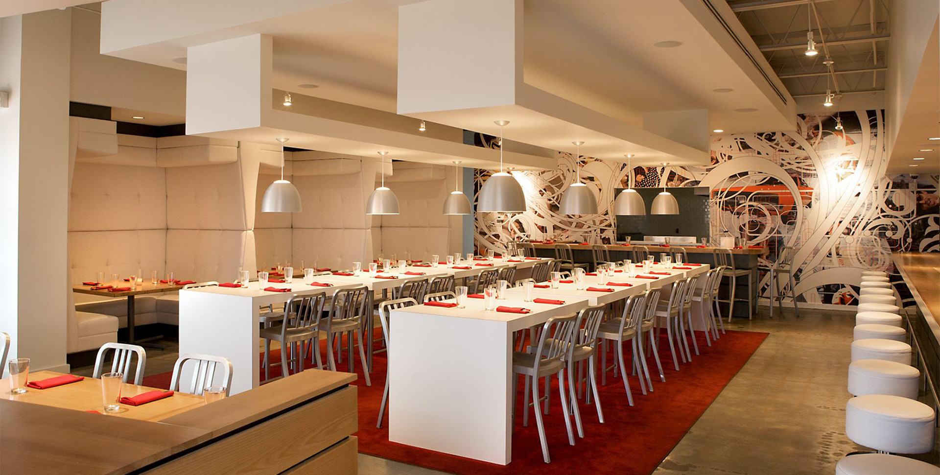
Staying true to the concept, the logo and branding for FLIP is lively yet sleek. Pops of color added to the clean black and white base palette further the interior design found within the restaurant. Much like the inverted dining area, the logo “flips” upside down continuing the playful narrative that is FLIP.
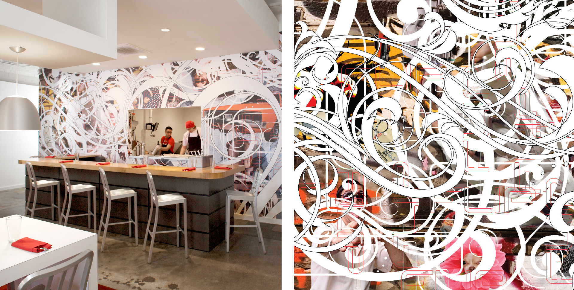
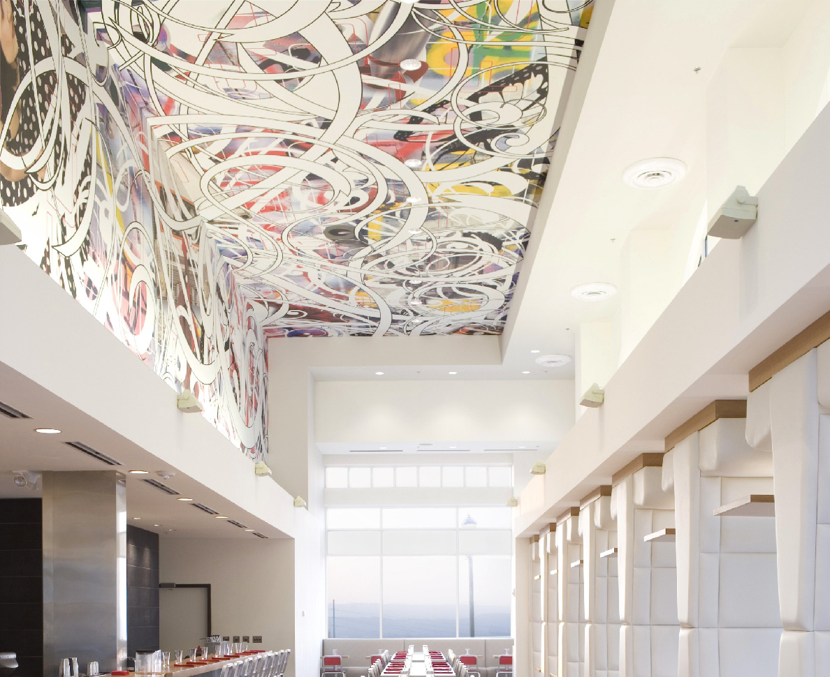
Intended to represent the local region, layers of images overlap one another, merging pop-culture with cultural relevance.
Project Services
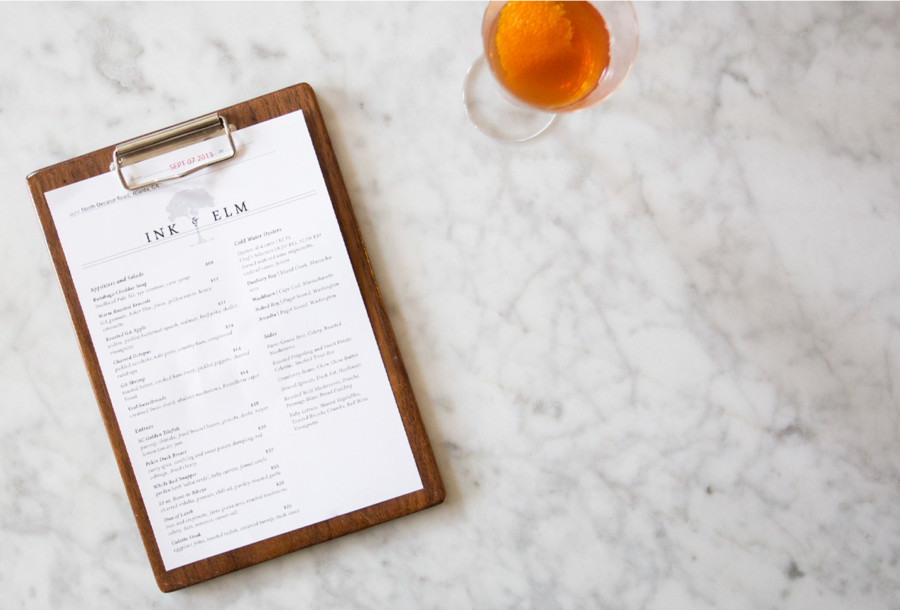
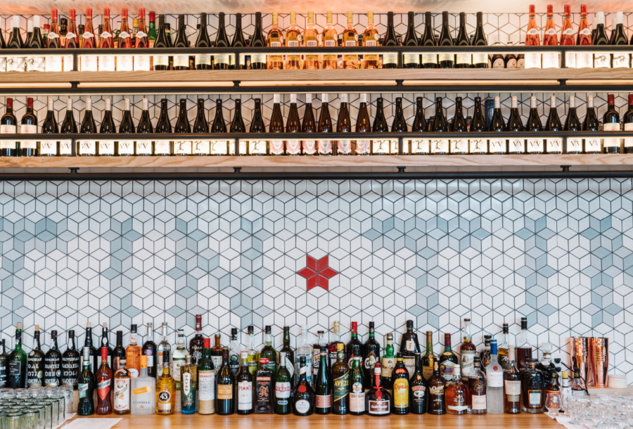
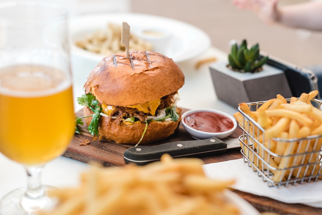
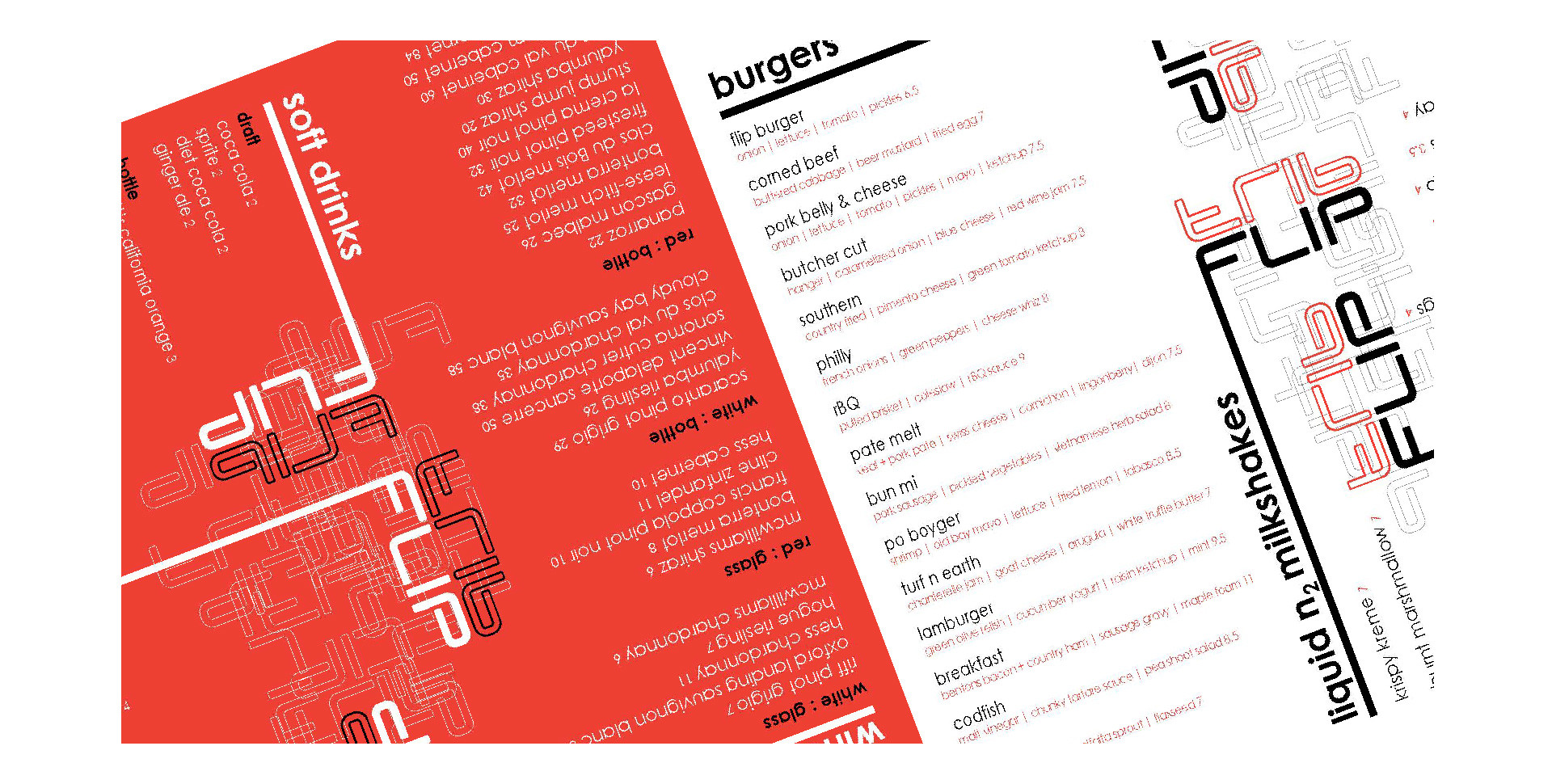
Brand Development | Logo Design | Full Branding Collaterals | Menu Design | Uniform Design | Environmental Graphics | Signage
GET IN TOUCH
Be free to dream with ai3 and start your project today
Projects